Good design is about good communication. It’s a type of conversation between the designer and the user that just happens to not use any words. When you think of it that way, it’s no surprise that Whole Brain® Thinking can have just as much impact on design as it can on any verbal or written conversation.
So, what does it mean to take a Whole Brain approach to design?
For us at Herrmann, Whole Brain Design means using the four quadrants in the Whole Brain® WalkAround format to answer these foundational design questions:

As Michael Scott once said: “Sometimes I’ll start a sentence, and I don’t even know where it’s going. I just hope I find it along the way.” Design is the same way. If we don’t start by defining a clear WHAT for our users then we’re just abandoning them to wander aimlessly, hoping that somewhere along the way they happen to do the thing we want them to.
The difficulty with defining the WHAT is that there’s often a temptation to try and say everything at once: solve every possible problem, answer every unasked question, anticipate every potential user’s need. But designs get confusing and overwhelming when designers try to solve every problem at once. The more we can break big problems down into smaller problems, isolating each separate WHAT and solving around it, the more we can simplify and streamline our designs. Once you have that WHAT, you’ll find that the rest naturally follows.
Whole Brain Design means figuring out the WHAT before anything else.
B Quadrant: HOW are we building it?
Good design doesn’t happen in a bubble; it involves input and feedback from across different teams, including everyone who will play a role in bringing that design to life. It’s one thing to create beautiful mockups, but without the HOW – that is, an implementation plan, including user testing and incorporation of feedback – those designs will never actually get to a point where users see them.
The HOW is all about sitting down with your coworkers and figuring out that nitty-gritty: the deadline, what the MVP (Minimum Viable Product) includes, the tools you should use, the technical details, how it fits into the existing UX flow, the pilot and launch plan, and so on. Those answers will guide your design choices, making them far more actionable, practical, and functional than they would have been.
HOW the metaphorical sausage gets made may not be the most enjoyable part of the design process, but it is arguably the most important – and without it, your designs would never actually go from great idea to usable product.
Whole Brain Design means thinking through the practical and technical implementation of our designs, ensuring they’re functional as well as beautiful
C Quadrant: WHO will be using it?
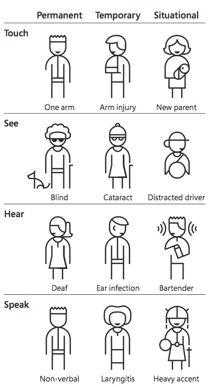
Like any good conversation, good design is empathetic. It attempts to understand where you’re coming from, how you’re feeling in this moment, and what you might be struggling with. Good design is focused on WHO is using it, and is usable by as many people as reasonably possible without the need for special adaptation.

Image Credit: Microsoft
The graphic above gives some wonderful examples of how everyone benefits from accessible, WHO-focused design. We may not currently be visually impaired, but at some point we’ll attempt to use our phone with sunglasses on or after having our eyes dilated at the optometrist. When we center the WHO in our design, we don’t think of these as “edge cases”. We consider them thoughtfully and sympathetically as fellow human beings in all stages and circumstances of life.
Whole Brain Design means centering WHO uses your product, thinking of your users as full people (not just personas), and designing things that are inclusive and accessible to everyone.
D Quadrant: WHY are we making it?
Being a designer comes with a certain responsibility; the products we put out into the world can help or hurt our users, depending on the choices we make. It’s easy to hand-wave away claims like that as being overdramatic or exaggerated, but I don’t believe that they are – more and more we see how the design choices of companies like Facebook or Twitter have real, tangible effects on their users. What’s to say that what we create is somehow the exception?
As a UI designer at Herrmann, I hope to create something that our users want to come back to over and over again; software that they enjoy engaging with and that adds value to their lives. I may not always hit that mark the first time, but that’s always the WHY that I’m working towards. And it logically follows that if my goal is for people to spend lots of time engaging with the designs that I create, then it’s also crucial that I take seriously the effects – intentional or unintentional – that my designs may have on their lives.
The Boy Scouts have a rule: always leave the campground cleaner than you found it. Everything we design, everything we put out into the world, should ideally leave things a little better than we found them. It’s our responsibility to ask: “WHY are we making this, and what effects – positive or negative – could our product have on our users?”
Whole Brain Design means looking at design choices in a holistic way: asking how we create positive impact through our work, as well as carefully considering any unintentional consequences.
When sitting down to wireframe out new pieces of our user interface for the first time, I find it effective to approach the problem from these four angles in order to create a design that’s focused, practical, accessible, and meaningful. As someone with a thinking preference code of 1121, I have a natural predisposition towards the B (green) and D (yellow) quadrants especially, which means I can sometimes overlook the C (red). Working through these four questions forces me to stretch out of my comfort zone – to the benefit of our users.

Autorin: Jacqueline Geist
Geschäftsführerin von Herrmann in Deutschland, Österreich und der Schweiz
„Unser Denken und die Art, wie wir die Welt wahrnehmen, Entscheidungen treffen und kommunizieren, entscheidet darüber, wie erfolgreich wir Veränderungen meistern."

